
The AI slide comes up in the quarterly review and everything on it is green. Seats assigned. Weekly active users climbing. Prompt volume pointed up and to the right, training completion parked at ninety-something percent. Then a board member asks the one question that actually counts - "so what got better?" - and the room stops. Nobody can name a report, a product, or a process that runs faster or cleaner because of the tool the company is now paying for.
That silence is the whole problem. It is not a people problem, though. It is a measurement problem. The dashboard is answering a question nobody in the room cares about . Licenses, logins, prompts, and training hours prove a tool exists and that people are touching it. They say nothing about whether the work changed. And changed work is the only thing the AI budget was ever meant to buy.
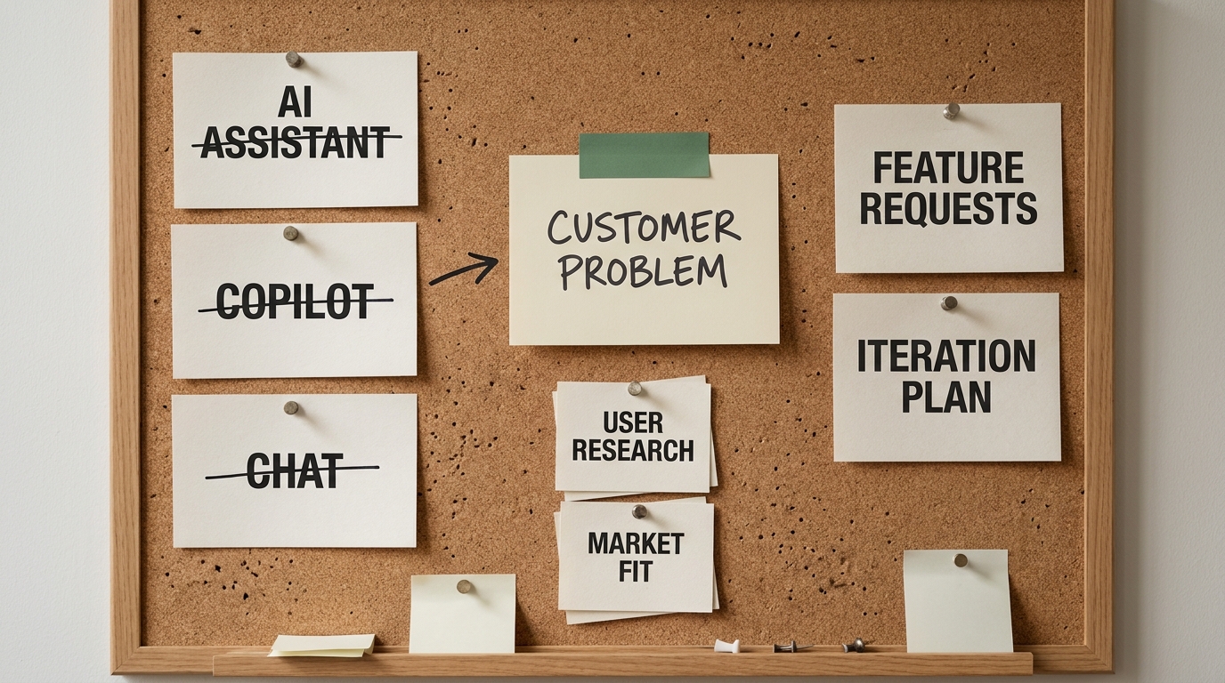
So here is the thesis, plain enough to repeat at the next board meeting: AI adoption is not usage. It is changed output. Your dashboard measures the first and quietly calls it the second. The fix is not a prettier activity chart. It is measuring the artifacts your teams actually produce, and how they changed.
The green dashboard problem
Look at what a typical AI adoption dashboard reports. Seats provisioned. Monthly and weekly active users. Prompts or messages per user. Features enabled. Training modules completed. Maybe a satisfaction score from a survey. Every one of those numbers can climb while the actual output of the business holds exactly where it was.
This is a category error, not a rounding error. Those metrics measure access and activity, and both are inputs. The board is asking about outcomes. A seat is a cost, not a result. A login is a habit, not a deliverable. A prompt is an attempt, not an improvement. Counting them tells you the tool is installed and someone opened it, which is about as useful as judging a gym membership by how often the keycard beeps at the door.
The dashboard feels rigorous because it has numbers and the numbers go up. But a green board built entirely from inputs cannot answer "what changed," because it never once looked at the work. You can have one hundred percent of your team logging in every day and zero percent of your deliverables getting better. The two facts have nothing to do with each other, and the dashboard is built in a way that hides that.
Usage versus adoption: the distinction that changes the budget conversation
Define the two words precisely, because the whole argument hangs on the gap between them.
- Usage is the fact that a tool was touched. Someone opened the assistant, typed something, got a response. Usage is real, it is easy to log, and it is a legitimate signal - just not of the thing you think it is.
- Adoption is the fact that a work product is measurably different because the tool was used. The pull request, the customer summary, the board deck, the hiring screen, the redesigned process - the artifact itself is faster, cleaner, or better than it would have been, and you can show the before and after.
Usage metrics earn their keep in exactly two situations. First, during early rollout, when you need to know whether people can even get in and start. Login and activation rates tell you if onboarding works. Second, for license hygiene, when finance wants to reclaim seats nobody touches. Both are operational questions about the tool.
The trouble starts the moment you use those metrics to answer a value question. "Adoption is at eighty percent" almost always means "eighty percent of licensed users logged in this month." That sentence sounds like impact and carries none. The budget conversation with the board is a value question. Bring usage data to it and you are answering the wrong noun with total confidence.
Why the metric got gamed, and why it is not your people's fault
When "prompts per week" becomes a target, it stops being a measurement. This is Goodhart's law at organizational scale, and it is worth saying out loud, because naming it protects your team from an unfair charge.
Set a usage target and people will hit it. They will run a few extra queries before the weekly cutoff. They will keep a tab open. They will use the assistant as a search box for things they already knew. None of that is dishonesty. It is a rational response to being measured on activity instead of outcomes. You asked for prompts. You got prompts.
So when the usage line is high and the value is invisible, the failure sits upstream of the employee. The organization deployed a tool, counted the clicks, and never defined what a changed artifact was supposed to look like. Nobody told the operations analyst that "adoption" meant her exception-handling cycle time should drop. Nobody told the account executive it meant faster, higher-quality proposals. They were handed a login and a leaderboard, and left to guess.
The move here is to stop blaming employees for "low adoption" numbers that were never measuring their work in the first place. Attack the dashboard. Defend the people. Your team did the reasonable thing with the incentive it was given. Change the incentive and the behavior changes with it .
The unit of adoption is a changed artifact
If usage is the wrong unit, what is the right one? The atomic proof of adoption is a single work artifact that is different or faster because AI was involved in making it.

An artifact is anything a team produces and hands off. In practice the list is short and recognizable across the whole company:
- A merged pull request or a shipped code change.
- A test plan or a QA checklist.
- A customer or ticket summary.
- A board report, a status update, or an internal memo.
- A sales proposal, a contract redline, or an RFP response.
- A redesigned workflow or a standard operating procedure.
Each of these pairs naturally with the signal that proves it changed. You are not chasing "was AI used." You are chasing a measurable delta on the artifact itself:
- Quality - fewer defects, fewer revisions, higher acceptance or win rate.
- Cycle time - less elapsed time from the intent to the finished artifact.
- Rework rate - how often the artifact bounces back for correction after it ships.
Adoption is real when you can hold up the artifact and its signal together: this proposal took a day instead of three, and the win rate held. That is a sentence about the work. It is the sentence the board wanted, and the one the dashboard could never produce.
Artifact-based measurement by role
The engineering-heavy version of this argument is everywhere, and it is incomplete. Most published frameworks stop at AI-touched pull request percentage and DORA-style delivery metrics, which serves one department and leaves the rest of the company counting logins. The artifact model generalizes cleanly. Here is what the changed artifact and its honest signal look like function by function.
Engineering. The artifacts are pull requests, test plans, and incident fixes. Track the share of merged PRs where AI contributed, but do not stop there, because "AI-touched" is not "AI-improved." Pair it with code survival rate (how much AI-assisted code is still in the codebase weeks later), cycle time on merged work, and the rework or incident rate on AI-assisted changes. The honest caveat: faster PRs that spawn more production incidents are not adoption, they are debt.
Operations. The artifacts are handled exceptions, processed cases, and redesigned procedures . Measure process cycle-time reduction, exceptions resolved per person, and SLA adherence on AI-assisted workflows. The caveat: throughput that quietly pushes error rates up is a false positive, so guard it with a quality check.
HR and People. The artifacts are screening summaries, job descriptions, and policy documents. Track time-to-fill, the quality and consistency of screening summaries, and turnaround on policy or documentation updates. The caveat: speed in hiring means nothing if candidate quality or fairness slips, so hold a quality signal next to the time signal.
Go-to-market and knowledge work. The artifacts are proposals, reports, decks, and meeting summaries. Track proposal turnaround, first-draft-to-final ratio (how much editing the AI draft actually needed), report quality, and the reliability of meeting summaries people trust enough to act on. The caveat: a fast first draft that gets rewritten from scratch is not adoption, it is theater.
Notice the pattern. Every role has an artifact, a before/after signal on that artifact, and a guardrail that stops speed from masquerading as value. None of it needs a new tool. It needs someone willing to look at the work instead of the login .
Cycle time is the one number that generalizes
If a CEO wants a single cross-functional adoption number to watch, cycle time is the honest candidate. Across every function the cleanest question is the same: how long does it take to go from intent to a good-enough artifact? Intent to merged code. Intent to sent proposal. Intent to filled role. Intent to closed exception.
Cycle time works because it is measured on the artifact, it exists in every department, and it is hard to fake without actually changing the work. You cannot inflate it by opening more tabs. It moves only when the path from idea to output genuinely gets shorter.
The trap is optimizing cycle time on its own. Speed with no quality guardrail just means you ship worse work faster, and the rework it generates erases the gain a month later. Always pair the cycle-time number with a quality signal for that artifact - defect rate, revision count, win rate, acceptance rate. Faster and at-least-as-good is adoption. Faster and worse is a regression wearing a green badge.
Two examples of adoption you can actually see
Abstractions are easy to nod at, so make it concrete. The numbers below are illustrative ranges, not sourced benchmarks - the point is the shape of the proof, not the specific figures.
Engineering. Before: a team runs a roughly four-day pull-request cycle, with hand-written tests that lag the code. After a quarter of real AI adoption: the cycle tightens to around two and a half days, test plans are AI-drafted and human-reviewed, and the rework and incident rate holds flat. What proves adoption is not that everyone has Copilot enabled. It is the changed artifact set - faster merges, more consistent test coverage, no rise in defects. The login count is beside the point.
Go-to-market. Before: proposals take about three days to turn around because the first draft starts from a blank page. After: the first draft lands the same day, assembled by AI from prior proposals and the deal notes, then finalized by a human, and the win rate holds or ticks up. Adoption here shows up in the turnaround time and the sustained win rate, measured on the proposal itself. Nobody had to check whether the account executive was "actively using" anything.
In both cases the evidence is an artifact and its signal, side by side, before and after. That is what goes on the slide. That is what answers "so what got better."
Measuring changed output without turning it into surveillance
Every executive who hears "artifact tracking" has the same fair worry - is this keystroke monitoring by another name? It should not be, and the distinction is not cosmetic. Artifact measurement looks at the work product. Surveillance looks at the person.
Keep the measurement on the right side of that line with a few rules. Aggregate at the team or workflow level, not the individual. Measure the artifact and its cycle time, not activity logs, screen time, or keystrokes. Report deltas on the process ("proposal turnaround dropped from three days to one"), not scorecards on people ("Dana ran forty-two prompts this week"). The goal is to learn whether a workflow got better, which is a question about the workflow.
This is also better measurement, not just kinder measurement. Individual activity data is noisy, easy to game, and tells you nothing about outcomes. Workflow-level artifact data is the thing the board actually asked about. Respecting the privacy line and measuring the right thing turn out to be the same decision, which is a rare bit of good luck in this work.
Common mistakes when you switch to artifact-based measurement
The model is simple, and that is exactly why it is easy to implement badly. The failures that keep recurring:
- Counting artifacts with no baseline. "We produced two hundred AI-assisted summaries" means nothing without the before. Capture the baseline cycle time and quality first, or you have a number with no delta.
- Optimizing cycle time alone. Speed without a quality guardrail ships faster garbage, and the rework eats the gain. Always pair the two.
- Letting the measured team self-report. If the group being evaluated also owns the metric, you have rebuilt the gamed dashboard with new words. Pull the signal from the system of record where you can.
- Rolling out org-wide before one workflow is proven. Instrument a single workflow, prove the delta, then expand. A company-wide artifact program with no proven example is just a bigger dashboard.
- Confusing "AI-touched" with "AI-improved." Involvement is not improvement. The artifact has to come out measurably better or faster, not merely to have passed through the tool.
Every one of these is a quiet slide back toward measuring activity. The discipline is to keep your eye on the artifact and its baseline.
What to do in the next 30 days
You do not need a platform, a committee, or a new budget line to start. You need one workflow and one month.
- Pick a single high-volume workflow where the artifact is obvious - proposals, ticket summaries, pull requests, screening notes.
- Define the changed artifact and the two signals that prove it moved: a cycle-time baseline and one quality guardrail.
- Measure for thirty days at the workflow level, not the person level.
- Report the delta to the board in one sentence about the work: "On this workflow, we went from X to Y, and quality held."
That single proven example does more for the AI-value conversation than a year of usage dashboards, because it answers the actual question. Do it once, credibly, and you have a template you can extend function by function .
Key takeaways
- Usage measures whether a tool was touched. Adoption measures whether the work changed. Your dashboard almost certainly reports the first.
- The unit of adoption is a changed artifact - a PR, report, proposal, summary, or workflow - paired with a signal that it improved.
- Every function has its own artifacts and signals. Engineering does not own this metric.
- Cycle time is the cleanest cross-functional number, but only when paired with a quality guardrail.
- Measure at the workflow level, not the individual, and you get better data and no surveillance.
If your dashboard is green and you still cannot answer "what got better," the problem is the measurement, not your team. An AI Readiness Snapshot maps which single workflow to instrument first and defines the changed-artifact and cycle-time baseline you can take to the board. Book a free 30-minute readiness call and stop measuring whether people touched AI - start measuring whether the work got better.